import matplotlib.pyplot as pl
import numpy as npPlots for machine learning ✅
1 Matplotlib
We will be covering key plotting APIs that will be very useful for visualization of machine learning data.
https://medium.com/mlpoint/matplotlib-for-machine-learning-6b5fcd4fbbc7
#
# an empty figure
#

fig = pl.figure(figsize=(3, 3))
pl.xlabel('X labels go here')
pl.ylabel('Y labels go here')
pl.xticks([0,1,2,3,4,5])

#
# get the axis object to set the tick labels
#
ax = pl.gca()
ax.set_xticklabels(['a', 'b', 'c', 'd', 'e', 'f']);
pl.figure(figsize=(6,6))

x = np.linspace(-2*np.pi, 2*np.pi, 1000)
y1 = np.sin(x)
y2 = np.cos(x)

pl.plot(x, y1, color='red', linestyle='-')
pl.plot(x, y2, color='blue', linestyle='--')

pl.legend(['y1=sin(x)', 'y2=cos(x)'], loc='upper right');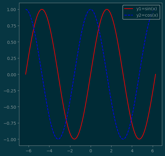
2 Line plots
#
# Plotting line with annotation
#

x = np.linspace(-1, 1, 20)
y1 = np.abs(np.random.randn(20))
pl.plot(x, y1, '-o')

pl.text(x[10], y1[10], 'midpoint', fontsize=12);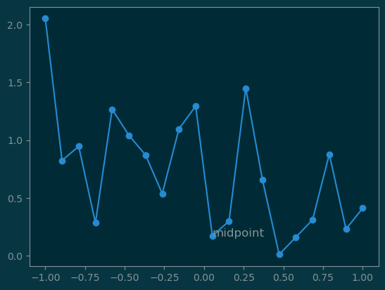
#
# Area plot
#

pl.fill_between(x, y1, color='blue', alpha=0.1)
pl.plot(x, y1, linewidth=2, color='blue');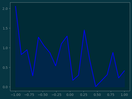
y2 = - y1 / 2

pl.fill_between(x, y1, y2, color='gray', alpha=0.5);
pl.plot(x, y1, x, y2, color='black', linewidth=2);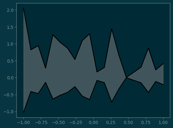
3 Bar Plots
names = ['Jack', 'Jill', 'Joe']
x = np.array([0, 1, 2])
grades = [70, 75, 80]

pl.bar(x, grades)
pl.xticks(x, names);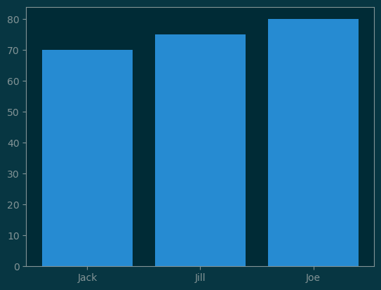
grades_winter = [95, 95, 90]

pl.bar(x+0.00, grades, width=0.25, label='Fall')
pl.bar(x+0.25, grades_winter, width=0.25, label='Winter')
pl.ylim(None, 120)
pl.legend(loc='upper left');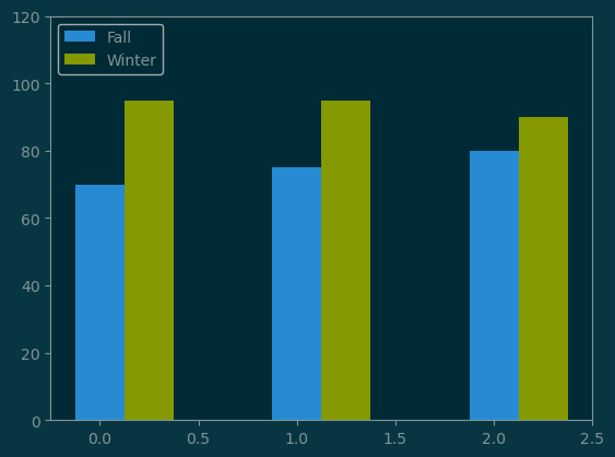
#
# final, midterm, quiz
#

grades = np.array([
    [30, 30, 10],
    [50, 30, 15],
    [45, 23, 5],
])

pl.bar(x, grades[:, 0], label='final')
pl.bar(x, grades[:, 1], bottom=grades[:, 0], label='midterm', )
pl.bar(x, grades[:, 2], bottom=grades[:, :2].sum(axis=1), label='quiz')
pl.legend()
pl.xticks(x, names);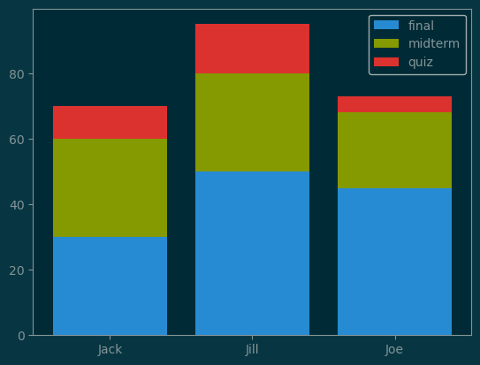
4 Scatter Plots
n = 500
x = np.random.randn(n)
y = np.random.randn(n)
pl.scatter(x, y, s=10);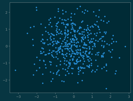
#
# with size variation
#
size = np.abs(np.random.randn(n)) * 30
pl.scatter(x, y, s=size, alpha=0.4, linewidth=0);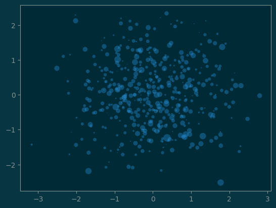
#
# with color variation
#

colors = np.full((n,), '#f00')
colors[x <= y] = '#0f0'

pl.scatter(x, y, s=size, c=colors, alpha=0.4, edgecolors='none');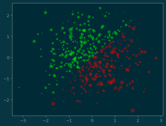
5 More to come
As we proceed further with the topics of machine learning, we will encounter more mathematical objects and ways to show them graphically.
We will look at:
- generate meshgrids
- contour plots of potential functions
- quiver plots for field functions
- 3D plots for higher dimensional datasets